recharge mi band 4 (5%, 23 days)
went to market basket in the morning to get some diet IBC root beer and bean sprouts for my aunt at the cafe
2nd aunt gave me a container of overcooked curry rice noodles for lunch
return silicone rings at UPS store
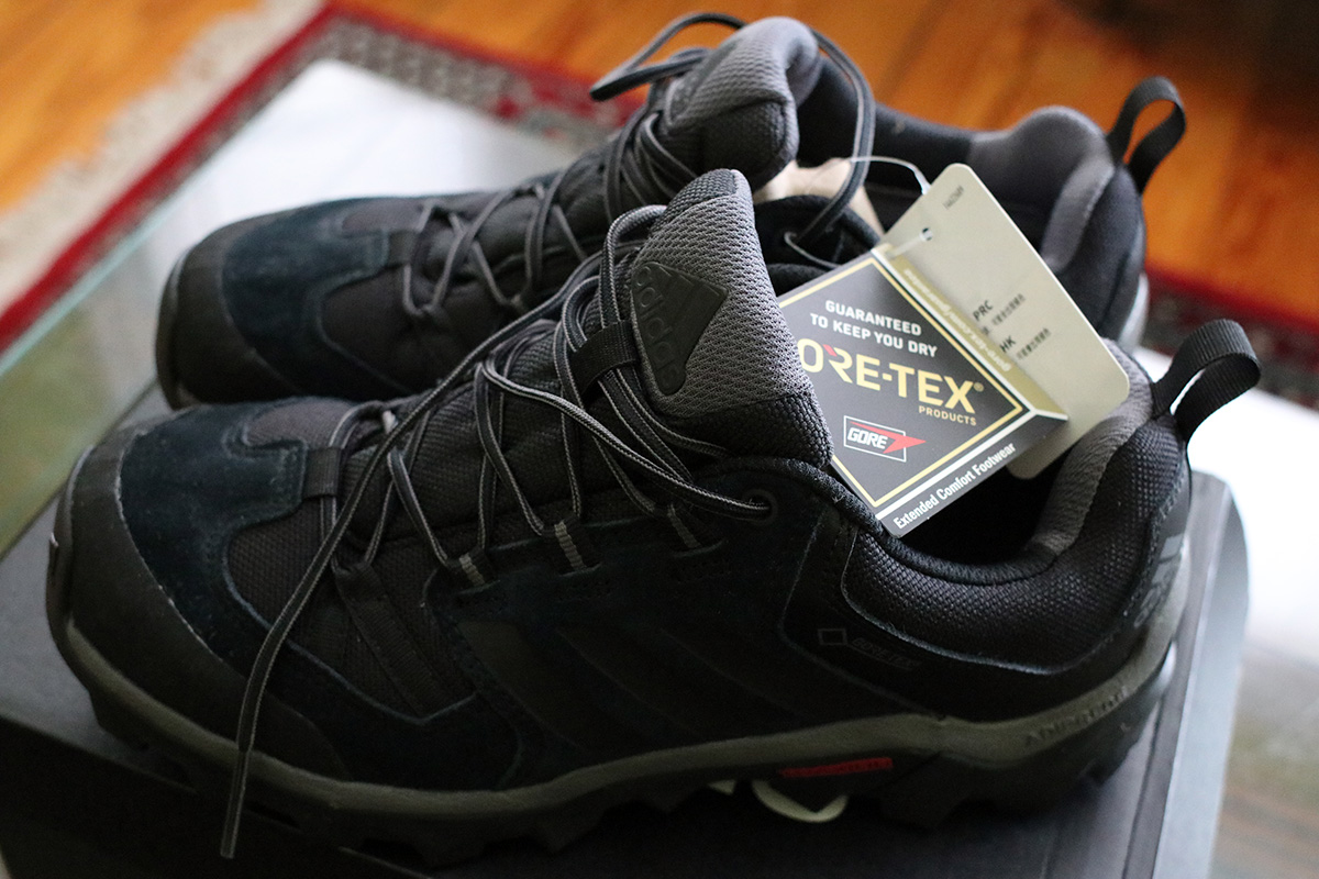
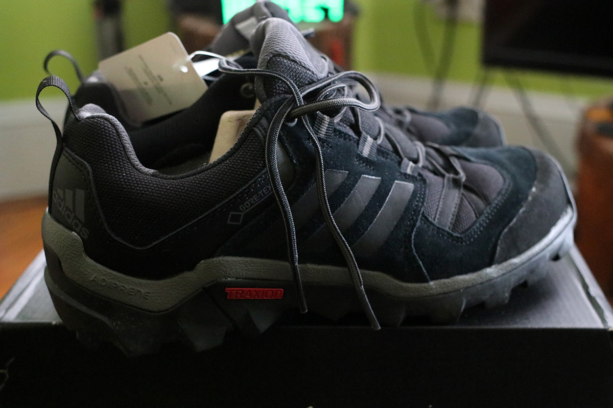
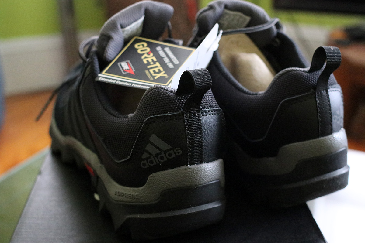
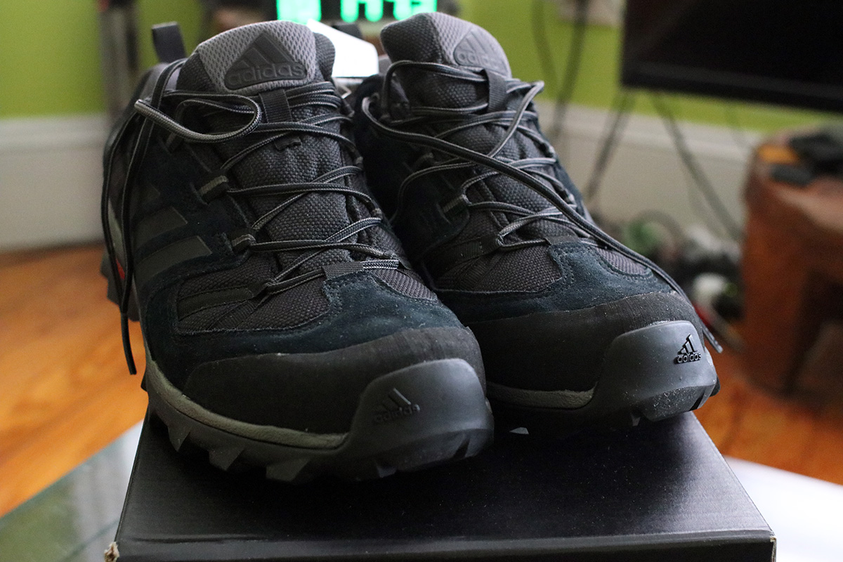
ride to the boston REI to return the adidas hiking shoes
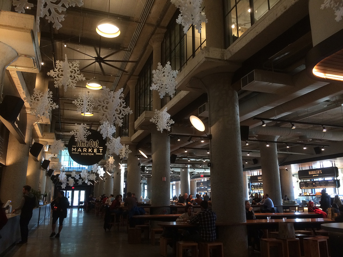
checked out timeout boston market
got some giant peruvian inca corn at the memorial drive trader joe's
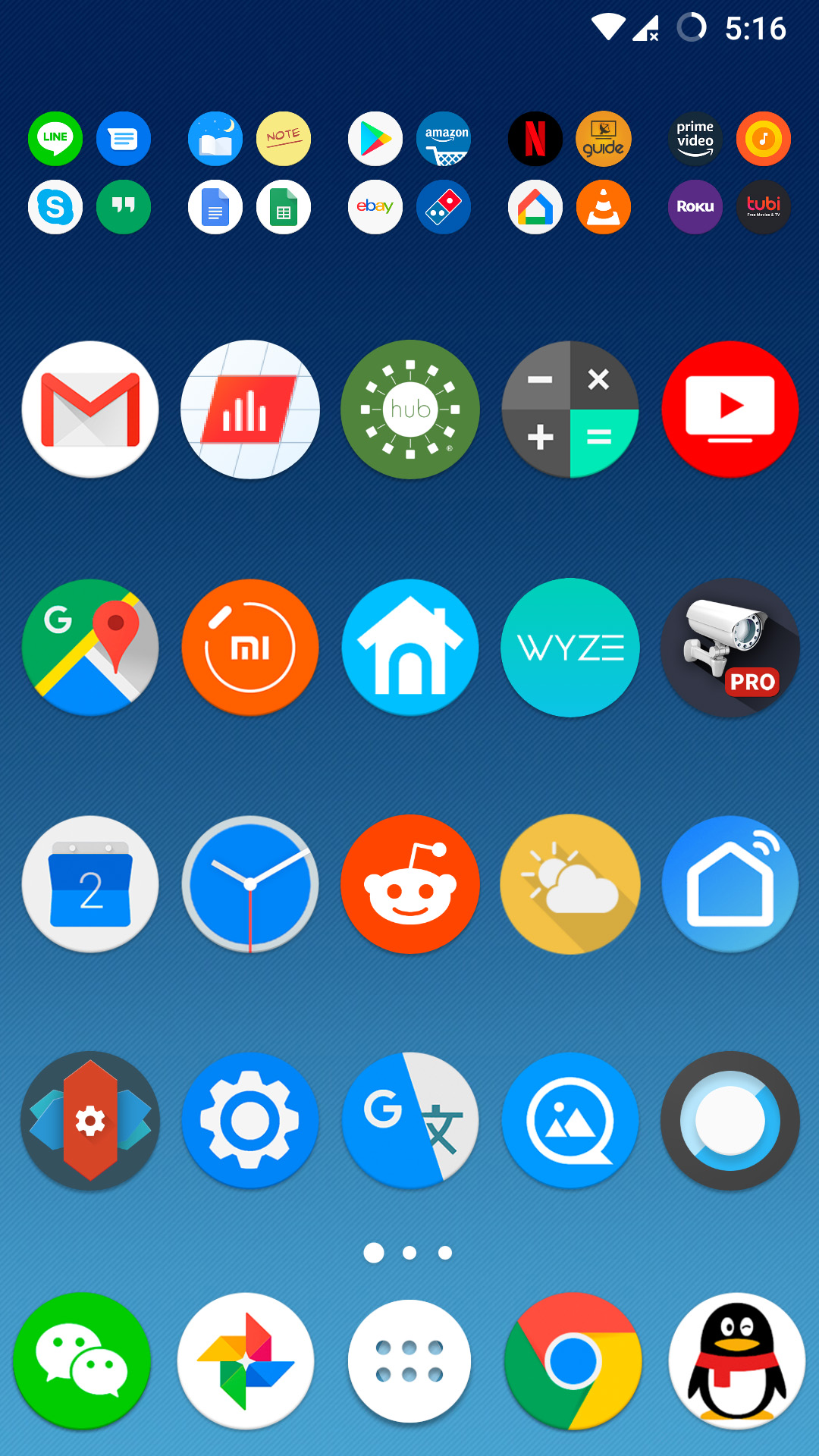
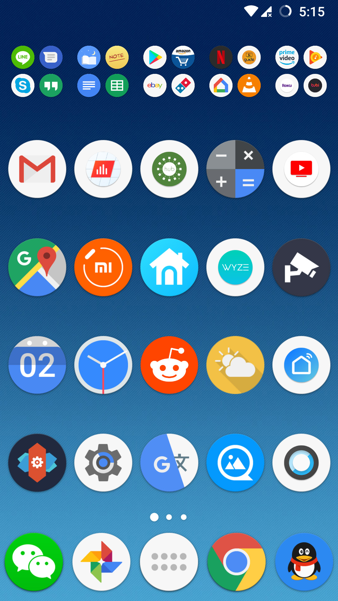
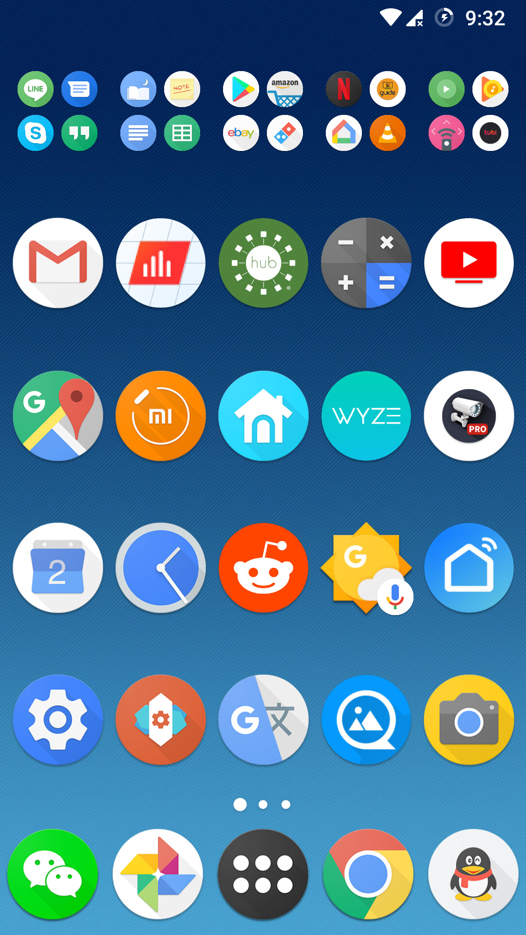
since i upgraded to lineageOS 16 on my oneplus one, i've been searching for a suitable icon pack. i really like the one i had before, but when the system finished restoring all my previous apps, that particular icon pack wasn't amongst the restored items. i also don't remember the name of that icon pack, and other than restoring to my old backup just to find out the name, i have no choice what to scour the google play store, trying to find this missing icon pack.
i like the simplicity of pixel icon pack (ru.pt.iconpack) but it may be too simple. i prefer my icons with a touch of shadows. identically named pixel icon pack (confusing, this one with an orange N icon) looks similar; i like the simplified custom icon for tinycam pro. this one however doesn't have any drop shadows either. pixel pie icon pack looks similar as well; however i don't like the "red home" icon for the nova launcher settings (can easily be confused with nest thermostat app and smart life app); pixel pie also has a stylized tinycam icon.
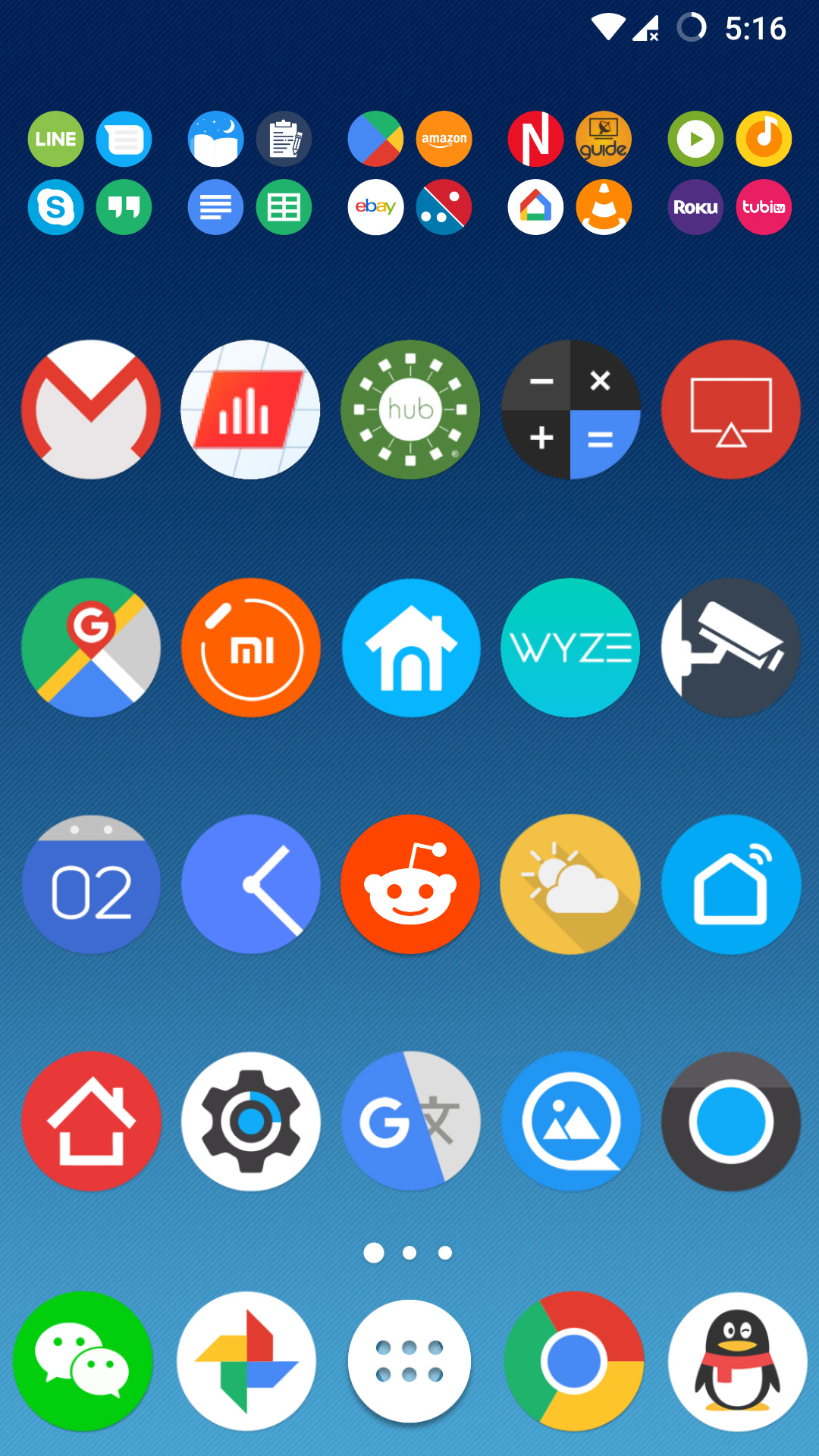
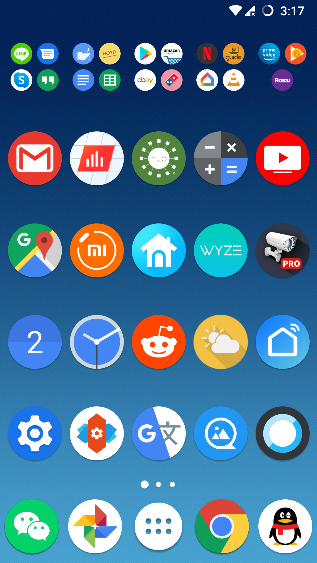
i downloaded a few new icon packs that do feature material design drop shadows. i really like aurora UI, but i find some of the icons on the light side in terms of colors, and i don't think the use of gradients is necessary, just my personal preference. that's why PIXXO UI (by the same designer) works better; it has the drop shadows but doesn't use gradients; the only thing i don't like about it is some of the secondary items could use some work (amazon, google music). i learned that turning off the autogen feature works better, makes for bigger more readable icons (e.g. solar edge, smarthub, google tv, wyze, smart life).
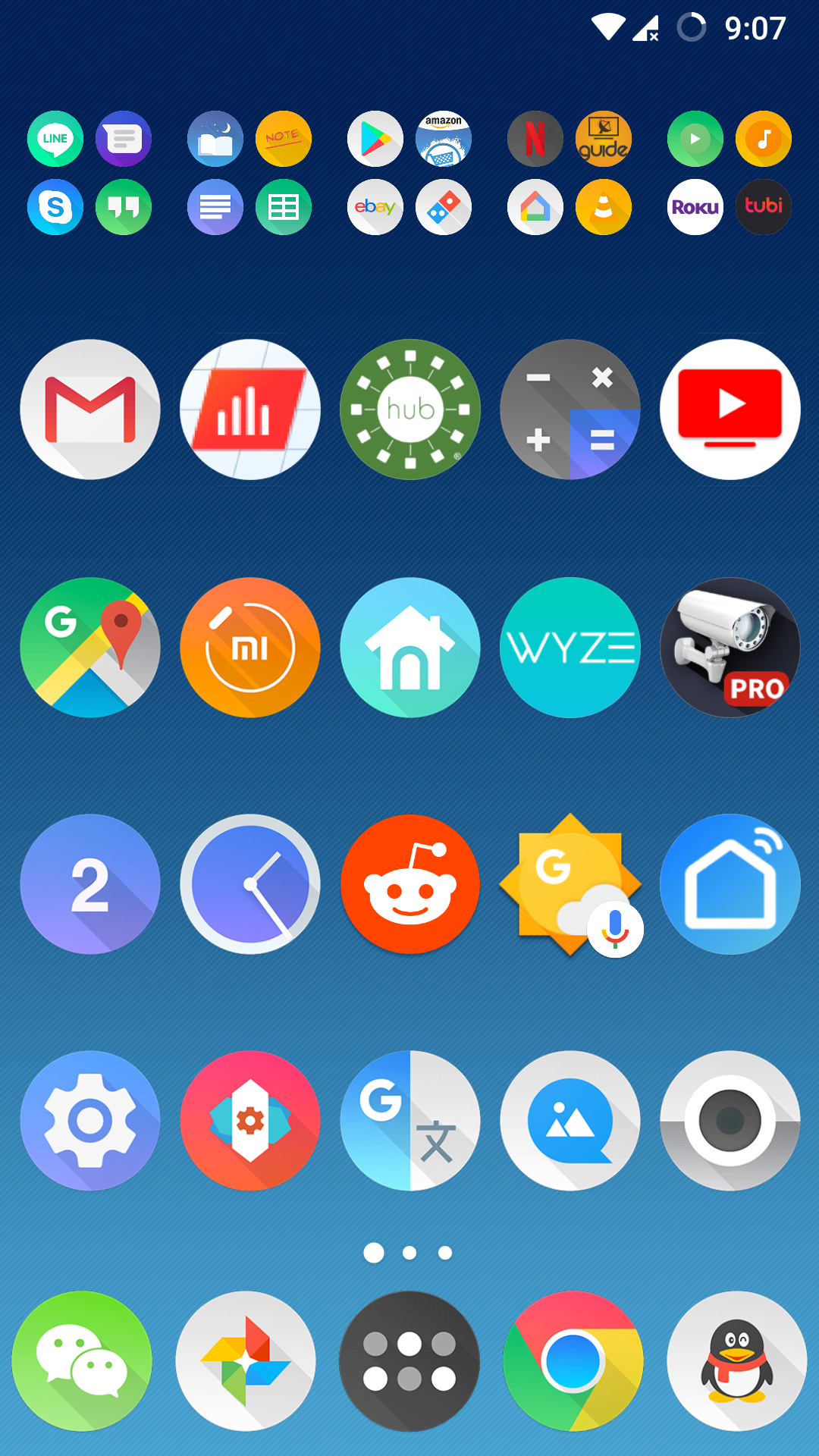
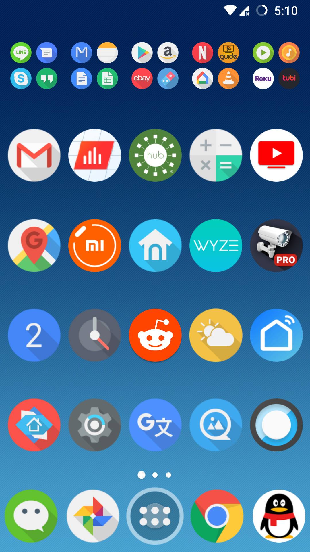
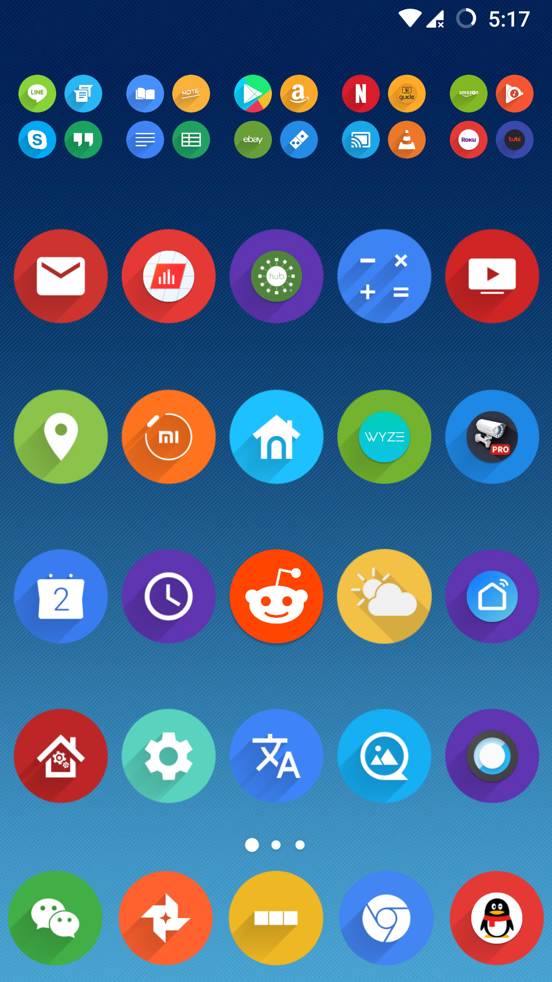
still nothing appealed me to, so i ended up buying a few from the google apps store. i really like the elegant simplicity of the adaptive icon pack, even though it doesn't have material design drop shadows. there's a lot about click UI that i really like - the wechat icon, some secondary icons; but i really hate what it did to the nova launcher settings icon, looks pretty awful and over complicated. finally, i discovered rondo icon pack, a free pack. i love the drop shadows, even though they're pointing in the wrong direct; icons look good but the white silhouette on colored backgrounds can be a bit sparse.
kevin gets home at 5:30pm, finally pays the rent